BARKLEYOKRP
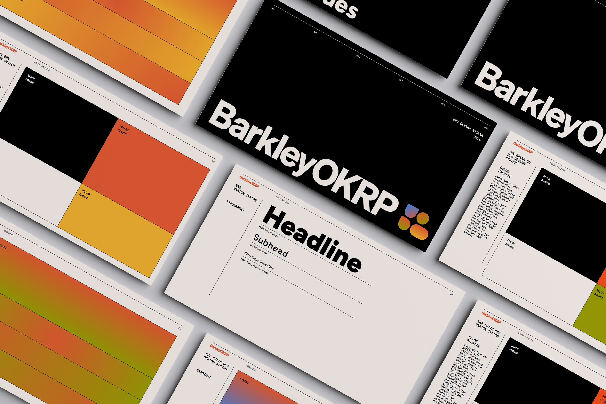
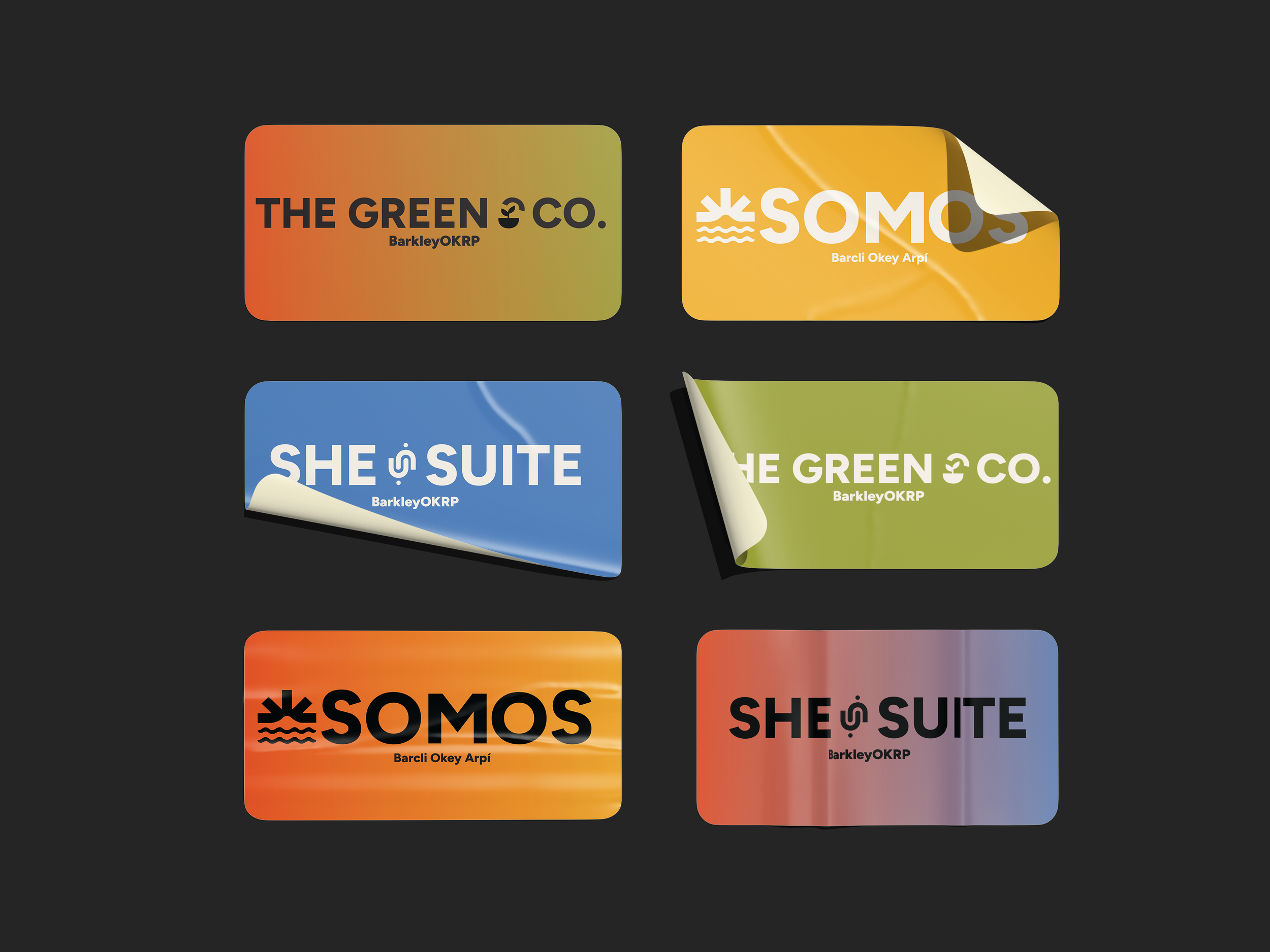
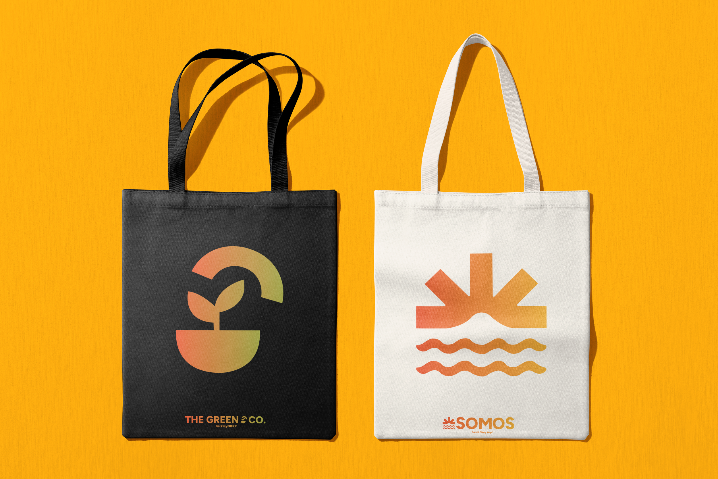
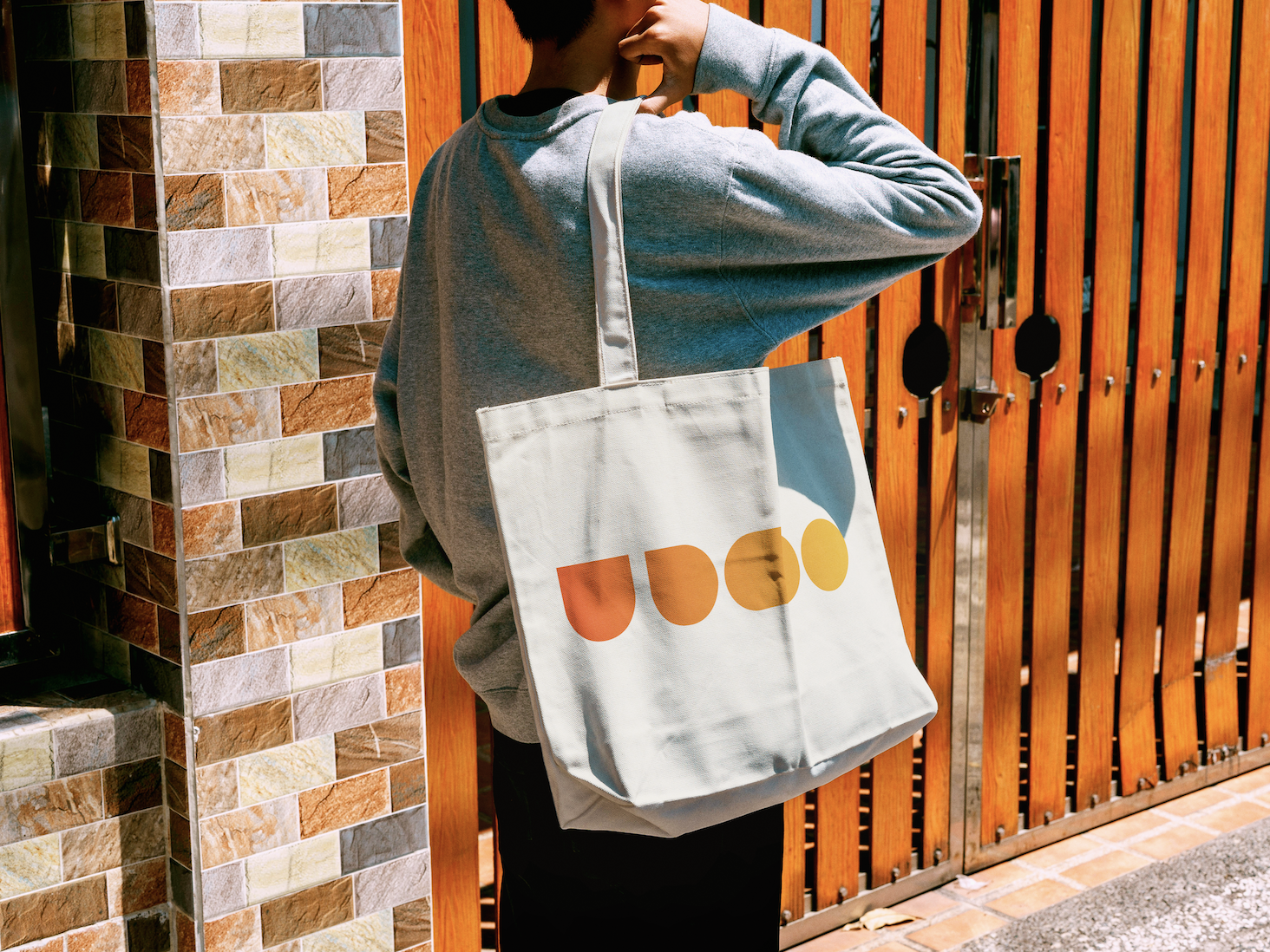
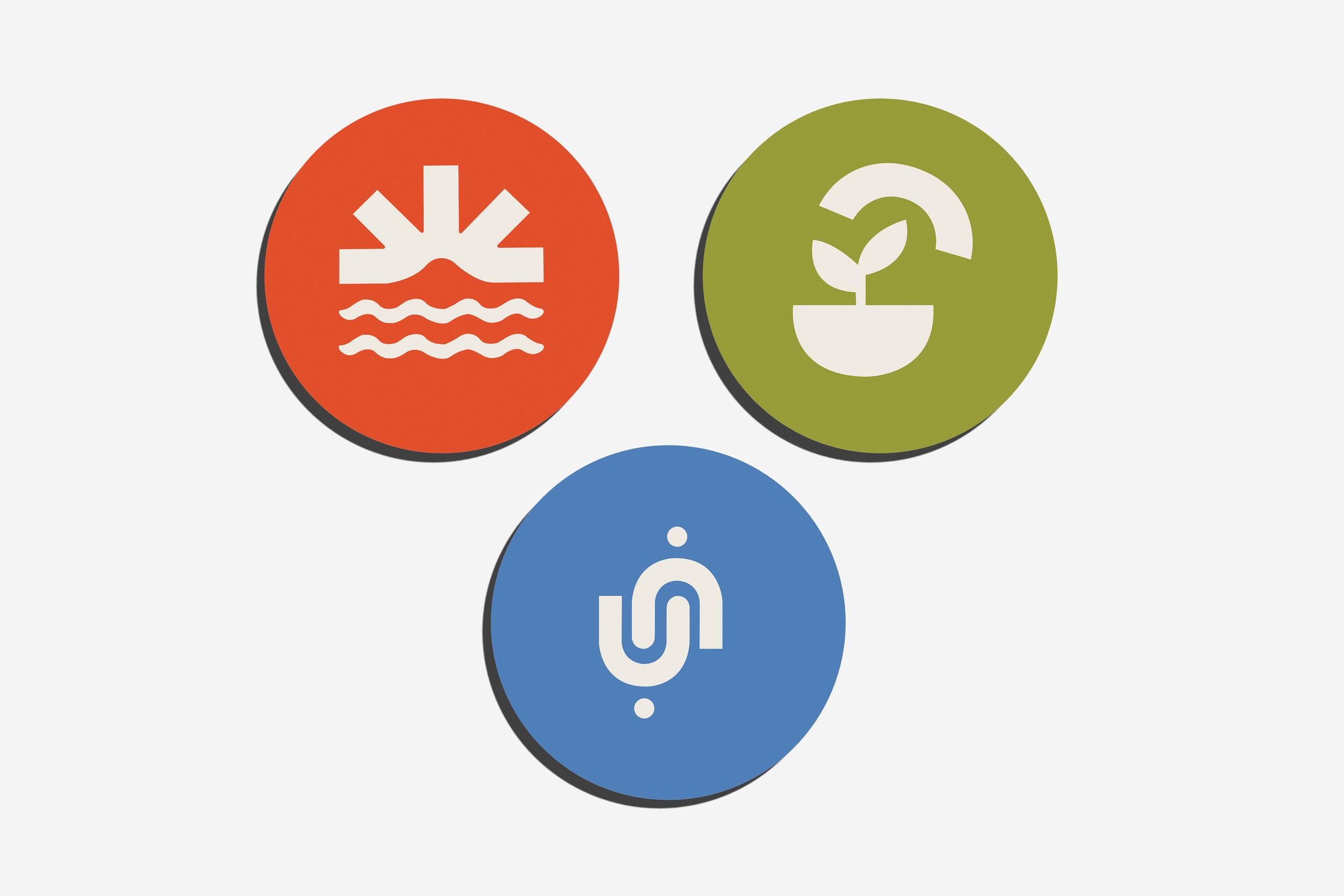
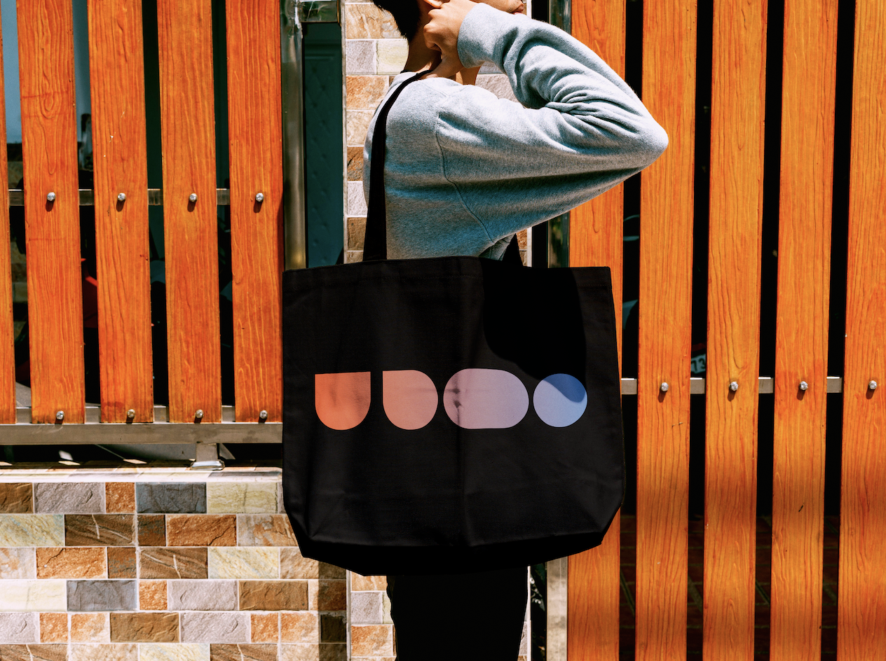
This project focused on reimagining the brand identities for BarkleyOKRP's Business Resource Groups (BRGs), creating a system where each group feels distinct, recognizable, and true to its mission while remaining connected to the overall BarkleyOKRP brand. I helped develop the creative strategy and visual identity system, designing logos, symbols, color palettes, typography, and supporting brand assets that established a framework the remaining BRGs can continue to build from.
Challenge:
Each BRG represented a different community, mission, and culture, but their identities lacked a cohesive system that connected them back to the BarkleyOKRP brand. The challenge was creating visual identities that felt unique without losing consistency across the organization.
Solution:
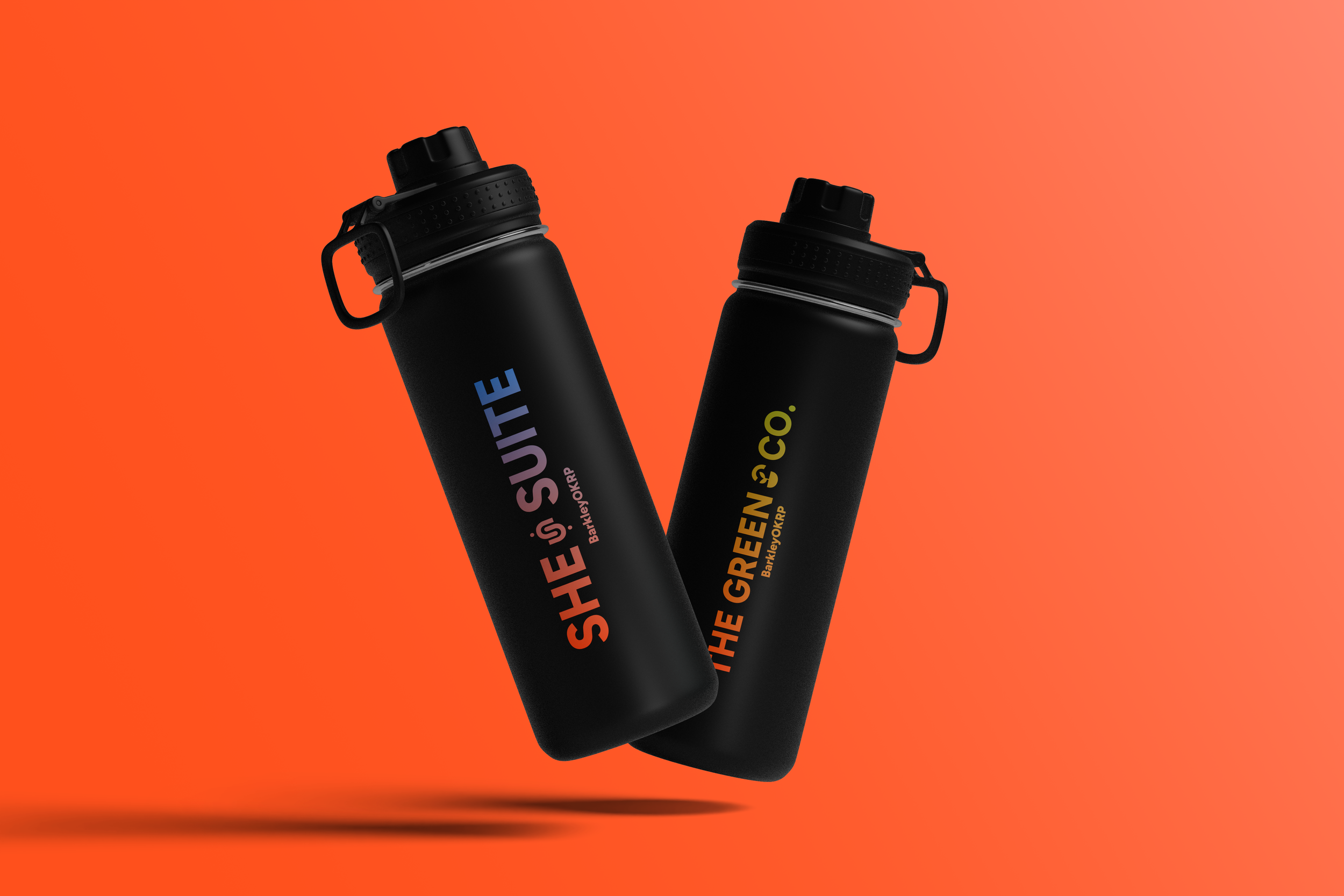
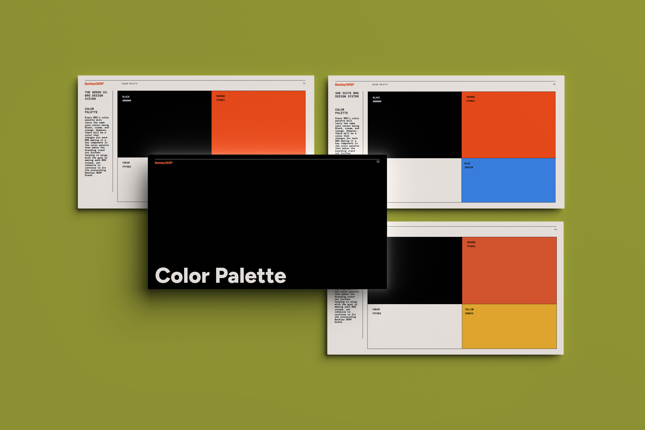
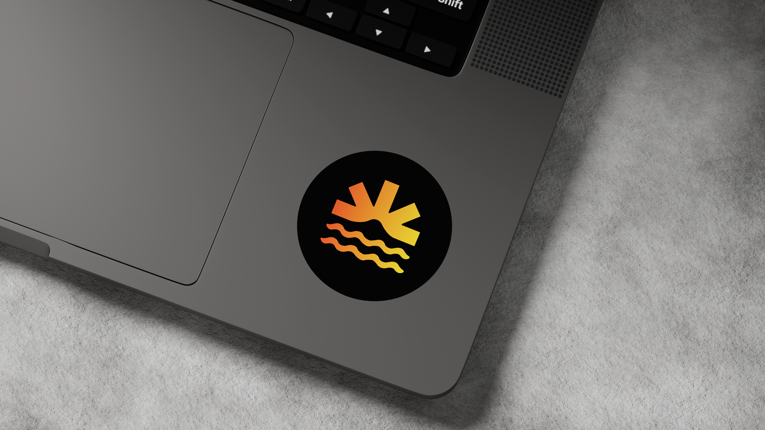
I helped create a flexible brand identity system that balanced individuality with consistency. Each BRG shares a common foundation through BarkleyOKRP's typography and core brand elements, while custom symbols and unique accent colors give every group its own recognizable identity.
Approach:
Over the course of the project, we completed 3 of the 7 BRG identities while developing a scalable framework for the remaining groups. By establishing clear guidelines for logos, color palettes, typography, symbols, and supporting brand assets, the system can continue to grow while maintaining a cohesive visual language across every BRG.